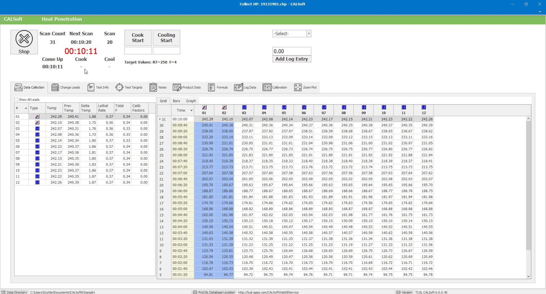
The default view during Heat Penetration Data Collection is called the Data Collection tab or the "Main Data Collection Screen." This screen displays only all "active" channels (Free Leads and Thermocoupled Containers). CALSoft will actually scan and record temperatures on all 32 channels during data-collection. However, you will only see the channels during data collection that are designated as Free Leads or Thermocoupled Containers.
This screen/tab displays two grids of information:
Incoming Lead Grid-
The Incoming Lead Grid displays the channel number, type (graphically shows Thermocouple or Free Lead), current reading, previous reading, the difference between the two ("Delta T"), the lethal rate, and the accumulated F (Total F). Any calibration factors that are applied are shown in the last column.
CALSoft will help you visually know which channel is the highest and lowest. The Thermocoupled container with the highest reading is displayed in RED and the lowest reading in BLUE. Since this is a Heat Penetration test, Free Leads are not considered in the high-low feature.
You can sort any column by clicking the column heading.
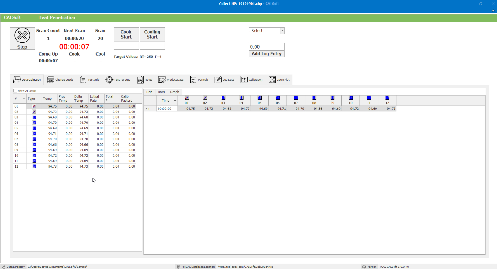
Time/Temp Grid, Bars, and Graphs-
You can view your data as a Time Temperature Grid. The "Grid" displays your data in a spreadsheet format. By default, the most recent scan is displayed at the top of the grid. To reverse this order, simply click on the "Time" column heading.
Channels with "Free Leads" are marked graphically under the Channel number and are displayed as BLUE columns to visually assist you in determining which channels are Free Leads and which are Thermocoupled Containers.
You can also view your data as a Bar Graph. The "Bar" tab displays your data in a graphical format. The "TARGETS" entered in the Test Documentation screen when you set up the HP test will be used on this bar graph to let you know when the targets are reached. Once the readings reach the desired targets, the bar will turn colors to alert you that the target has been reached.
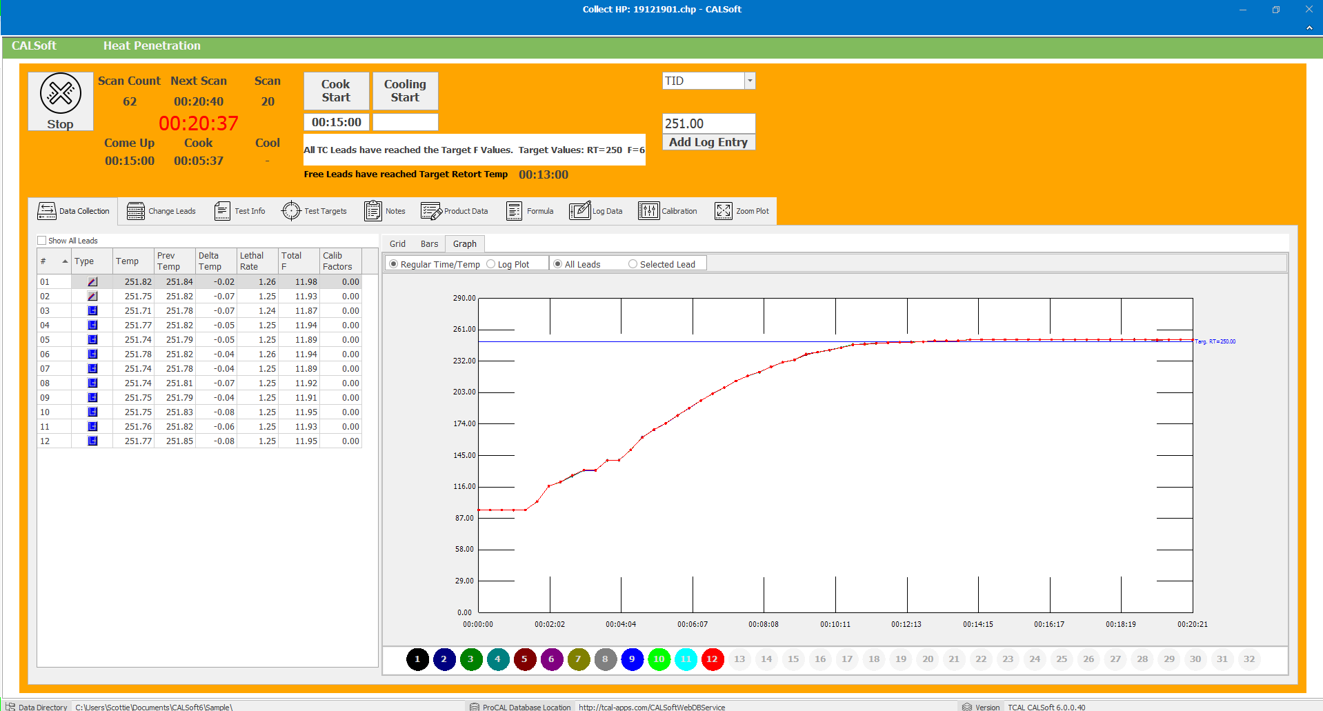
The Temperature is displayed on the left-hand vertical axis, with the "TARGET RT" displayed as a horizontal line on the grid.
The Accumulated Lethality is displayed on the right-hand vertical axis, with the "TARGET F" displayed as a horizontal line on the grid.
To update the Target RT or F, go to the Test Targets tab.

You can also view your data as a Time/Temperature Plot Graph or Log Plot Graph. The "Graph" tab displays your data in a plotted format. The plots can be against a Regular Time/Temperature Plot or against a Log Plot (Ball Plot). You can choose to show all leads or just a specific selected lead.

You can navigate to other data views by using the tabs Change Leads, Test Info, Test Targets, Notes, Product Data, Formula, Log Data, Calibration, or Zoom Plot.